Feb 23 - Ryan DiNunzio
It’s a Family Crest, not a team logo.

Crests/badges are not logos - they are so much more. You need to first understand what a Crest is. Historically, the Family Crest is typically what sits atop a Coat of Arms; the crest alone can symbolize the holder or family, serving as a concise emblem of their heritage. It is passed down from generation to generation and doesn’t speak to an individual era. Much like a family crest that, through it’s intricacies and details, shares the history or tradition of the family - soccer crests and badges can tell the story of Club, its heritage, its supporters and even the fortunes of the town or city where it plays was founded. Crests/badges tell a story; on the other hand logos are just symbols or marks for recognition.
When it comes to sports in particular. Take a look at where most teams place logos - side of helmets, front of a cap, sleeve of a jersey. Some teams don’t even have logos on their uniforms. But what about soccer? Outside of the occasional artistic/abstract third jersey (circa Puma 21/22) that maybe don’t include a crest or badge, where will you always find a crest/badge located? Front left chest. Contrary to some belief, it has nothing to do with manufacturer preference, quite honestly they like their mark to be on the left chest - look at every blank Nike or adidas polo in Dick’s - teams/clubs, long before manufacturer marks donned kits, place their club badge/crest on the left front chest over the heart. You wear the badge over your heart…similar to military medals. The crest/badge location is also a contributing reason as why the traditional arm for a captain’s band is the left arm, it is the closest spot to the crest and the player’s heart.
The first recorded use of a crest in an international match occurred in 1872, worn by
Oxford University, representing England. It was a woven crest of three stacked lions
on a wool kit.
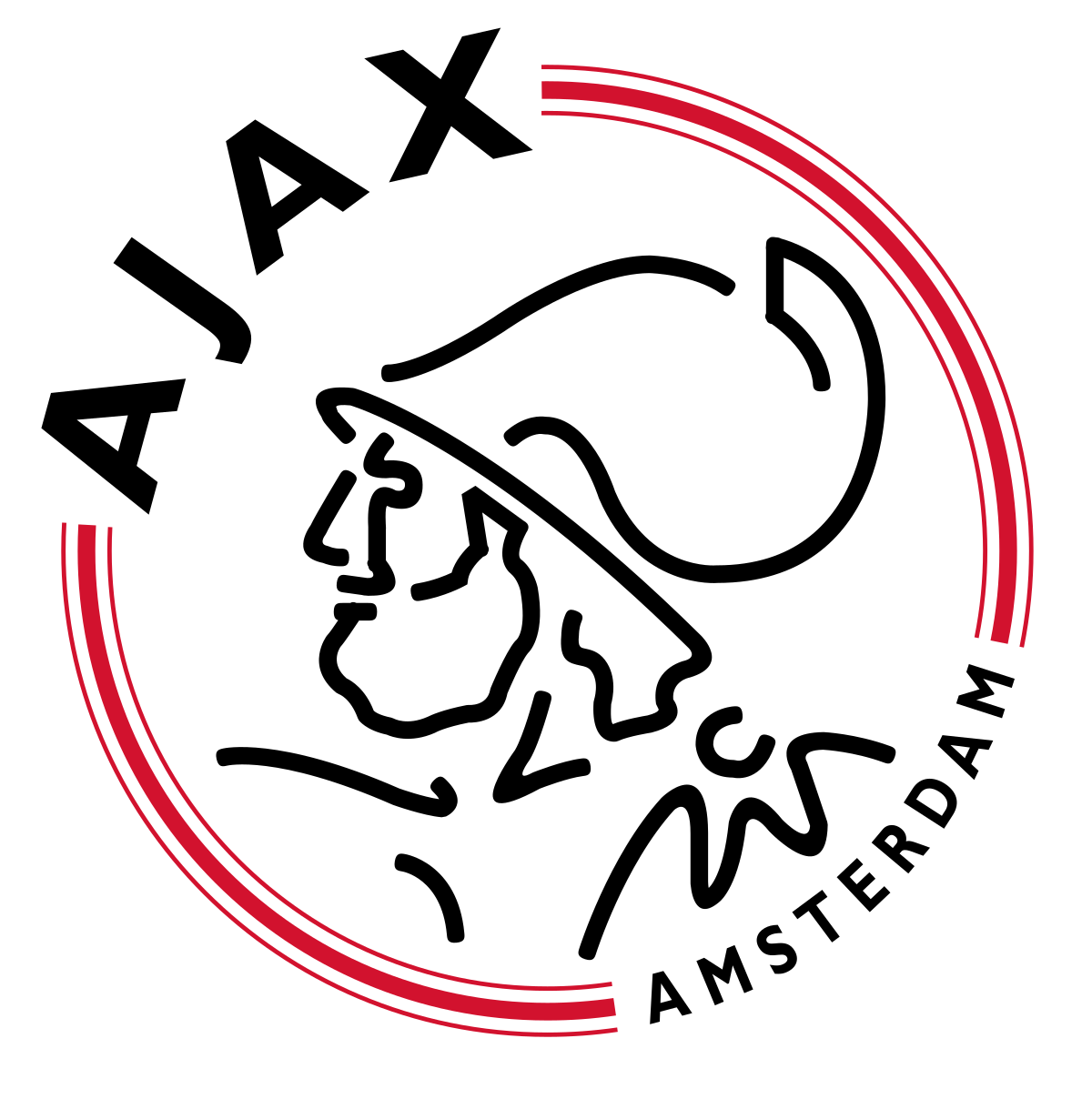
Crests tell a story - from Amsterdam Ajax AFC being created with 11 individual lines
used to create the outline of Ajax, a Greek hero and fabled warrior in Homer’s Iliad, to
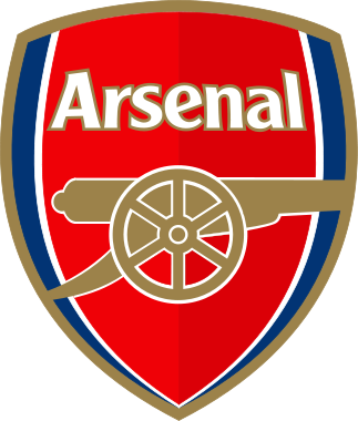
the canon of Arsenal FC (founded by the Royal Munitions workers of London); to
Barcelona’s cry for independence using St. George’s cross (the patron saint of Catalonia),
while the four red stripes on the yellow background are for the Catalan flag, a region
in Spain who has long sought independence and stood against the monarchy - oddly
represented by Real Madrid. There is so much depth and complexity to the crests and
badges of Clubs.
It’s why we don’t call it a logo. It is our family crests. It stands for who we are and where we come from.
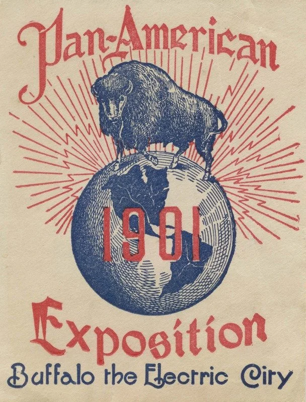
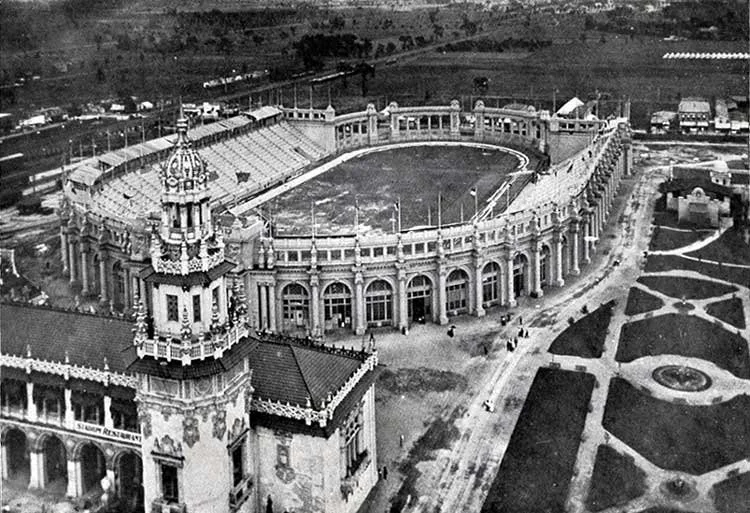
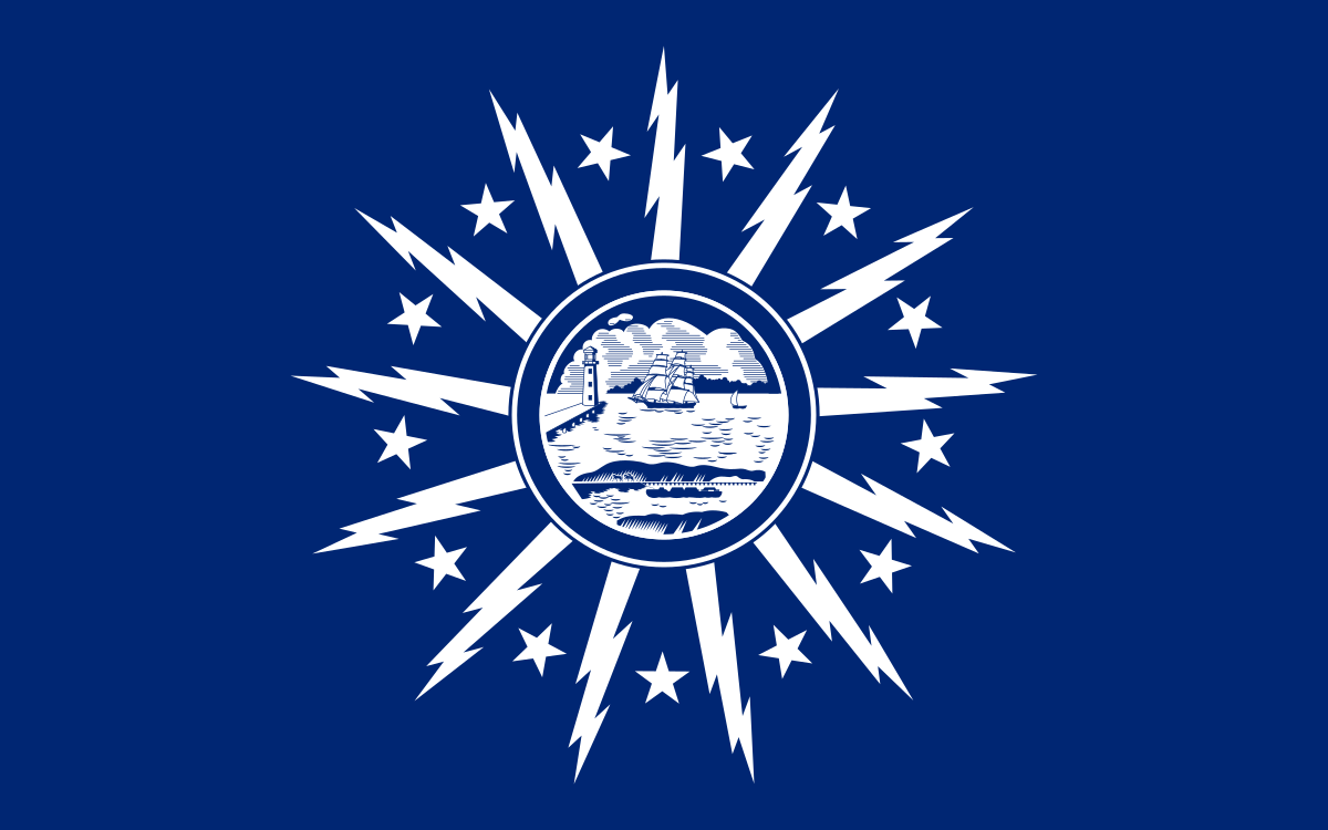
Our crest was inspired by the city we represented. Pulling elements from the city flag, it is combined with colors to represent the waterfront. Though blue and gold stand for pride and excellence, they also represent the blue of the lake and the the yellow of the sun. Not only do the elements of the crest draft from the city flag, they pay homage to the City of Light. Buffalo was first coined the City of Light/Electric City at the turn of the 20th Century when it hosted the Pan-America Expo in 1901, it was the first metropolitan city to be lit up by electricity at night - one of the marquee elements of the event. Fast forward roughly 120 years, our Academy and Senior teams currently train on the location where the Pan-Am Expo’s sprawling Athletics Stadium once stood. With a capacity of 12,000, and built for just around $125,000, the stadium hosted various events such as Equestrian, Track and Field event AND international and domestic soccer matches.
The FC Buffalo crest was designed by Jared Mobarak. Shortly after launching the crest, a short feature about FC Buffalo was done by CNN reporter and Buffalo-native Wolf Blitzer. “It was cool,” Mobarak said of seeing the FC Buffalo crest on CNN’s “The Situation Room with Wolf Blitzer,”. “I had put it on my Facebook and a bunch of family and friends ended up finding images of it. I sent the link around and my one cousin ended up Googling ‘FC Buffalo’ and found the web site and the page. It was cool to see the logo on national television.”
Mobarak described how he came up with the idea for the badge.
“It was proposed to me to look at something Buffalo-centric and the flag, and the waterfront,” he said. “The flag had the simplest aesthetic that could be worked around.”
15 years on, the Crest still stands for the City of Light, the hope of progress and a brighter future tomorrow. We were the crest with honor, firmly over our hearts. We stand together as a family, not a collection of individual teams, but as a family united in development. Each and every moment we pull on that crest over our heart to play, train, coach or cheer/support, we do it with pride and love FOR OUR CITY.
Team badges are capable of creating a frenzy, fanaticism, passion and hatred all in equal measure.
“Just don’t call it a logo,” says Martyn Routledge, whose book The Beautiful Badge, written in partnership with Elspeth Wills, uncovers the often uncertain provenance of club crests. “Football fans hate using the word brand … they really kick off if they think their club is a brand, but it is, and that’s not being offensive.”